Step-by-step creation of a scheduled report using components of the Agent Log explore.
...
- Scroll through the list on the left until you find a suitable dimension* for this statistic.
*This differs from the other two reports that were created (Call Report, Order Report), in that this has one dimension and multiple measures instead of one measures and multiple dimensions used as filters. CX Explore offers numerous configurations, your query can be tailored specifically to only the data you need.

Click through everything on the the left to find precisely what you are searching for. There are many options and it may take some time for you to familiarize yourself with them all. - Click the dimension to add it to the look. It will now be shown on the right side of the screen.
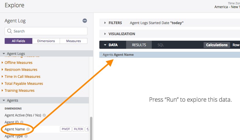
- Choose the measures for this look
- Click the Connecting Measures\ Total Connecting Hours measure to add it
- Click the Labor Measures\ Total Labor Hours measure to add it
- Click the Time In Call Measures\ Total Time In Call Hours measure to add it
- Click the Total Payable Measures\ Total Payable Hours measure to add it

Notice that if you click Run, the platform will return data but only using the default filter of Today.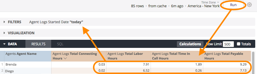
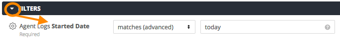
- Assign the filters for this look
- The only filter needed is the time frame for the month of July, 2017. This can be set by modifying the filter that is already there.
- Click the arrow to the left of FILTERS to view its settings
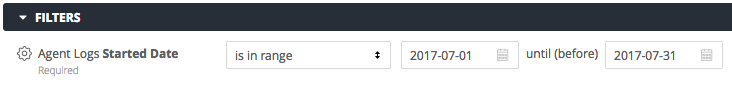
- Click the up/down arrow in the first text box and choose is in range
- Change the default start value (today's date) to 2017-07-01 by typing it in the text box, or click the calendar icon and click the desired date there

- Change the default end value (also today's date) to 2017-07-31 using either method
- Click the arrow to the left of FILTERS to view its settings
- The only filter needed is the time frame for the month of July, 2017. This can be set by modifying the filter that is already there.
- Click Run to test the query
- Choose a column to sort by

*In this example, the data will be sorted alphabetically by Agent Name. To sort in the reverse order, click up arrow to change it to a down arrow.
To sort by using another column's data, click inside that column header and the up/down arrow will appear there, indicating that the data is currently being sorted using those values. - Choose a Visualization option
- Click the arrow to the left of VISUALIZATION to expand the list of available choices
- Click through each to see how the data would be displayed
.png?version=2&modificationDate=1559839899395&cacheVersion=1&api=v2)
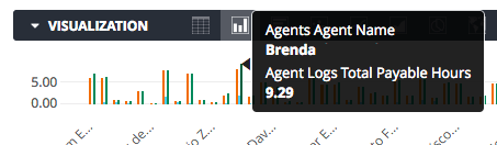
Think about how this data will be consumed before settling on a visualization. Do you need to see data and numbers for all agents? Then you'd want to stick with a Table. Do you just want to look at the data as a whole and pick out any high or low points? Then a column or scatterplot may work better for you. - Click the Column option
While viewing a Column chart in the Explore or in the Look, if you notice a statistic that you want more info on (in this case, a value that is higher than the rest), you can hover your mouse on it for more details: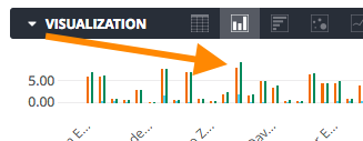
- Save the look
- Click the settings button in the top right

- Click on Save as a Look

- Add a Title and an optional Description
- Browse for a save location by choosing a folder on the left
Remember that saving into the Shared space means other users can access and make changes to this look. Saving into your Personal space means that only you can see it. - Click Save to save the look and return to the explore or click Save & View Look to save and then run as a new query.

- Click the settings button in the top right
...