Step-by-step creation of a scheduled report using components of the Agent Log explore.
This article covers:
*The Looks created in this article differ slightly from those used in the other articles from this series. For a simpler report creation how-to, please refer to the step-by-step for Creating a Call Report.

Before any report is created, it is recommended that you evaluate what is already present on the CX Explore platform. This article will walk you through everything required to create a report consisting of multiple looks, from start to finish. All of these steps may not be necessary if simple modifications to a LookML dashboard, or existing Looks will produce the same end result. Take stock of what you have already created in your Personal and Shared spaces, as some of the work may already be done!
If you find that other measures or dimensions, differing from those listed here, are more useful to you-- utilize them instead of or in addition to the sample. CX Explore is a powerful and extremely customizable tool.
1. Choosing the Dimensions and Measures
Put together a list of items that you would like the report to contain.
For example:
- Agent stats from the month of July, 2017
- Uptime totals:
- connecting hours
- payable hours
- in-call hours
- labor hours
- Downtime totals
- break minutes
- lunch minutes
- restroom minutes
- offline minutes
- Uptime totals:
2. Creating the Looks
The action items above can all be made into separate looks.
- Log in to CX Explore
- Click on your name in the left-hand navigation bar to load your personal space

*If you have not saved anything to your personal space, you will see the following message on the right:
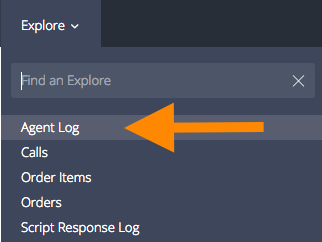
- Click on Explore, and then on Agent Log
The Agent Log explore will open, with its one default filter (Started Date= today)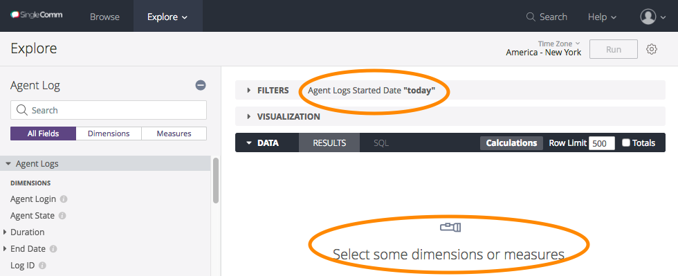
Agent Uptime
- Scroll through the list on the left until you find a suitable dimension* for this statistic.
*This differs from the other two reports that were created (Call Report, Order Report), in that this has one dimension and multiple measures instead of one measures and multiple dimensions used as filters. CX Explore offers numerous configurations, your query can be tailored specifically to only the data you need.
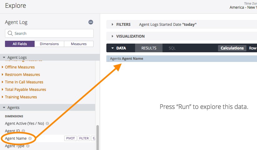
Click through everything on the the left to find precisely what you are searching for. There are many options and it may take some time for you to familiarize yourself with them all. - Click the dimension to add it to the look. It will now be shown on the right side of the screen.
- Choose the measures for this look
- Click the Connecting Measures\ Total Connecting Hours measure to add it
- Click the Labor Measures\ Total Labor Hours measure to add it
- Click the Time In Call Measures\ Total Time In Call Hours measure to add it
- Click the Total Payable Measures\ Total Payable Hours measure to add it

Notice that if you click Run, the platform will return data but only using the default filter of Today.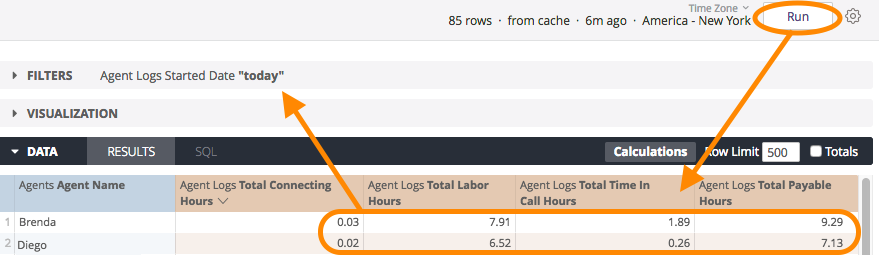
- Assign the filters for this look
- The only filter needed is the time frame for the month of July, 2017. This can be set by modifying the filter that is already there.
- Click the arrow to the left of FILTERS to view its settings
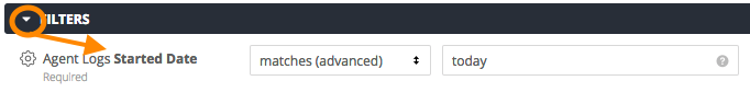
- Click the up/down arrow in the first text box and choose is in range
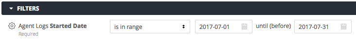
- Change the default start value (today's date) to 2017-07-01 by typing it in the text box, or click the calendar icon and click the desired date there

- Change the default end value (also today's date) to 2017-07-31 using either method
- Click the arrow to the left of FILTERS to view its settings
- The only filter needed is the time frame for the month of July, 2017. This can be set by modifying the filter that is already there.
- Click Run to test the query
- Choose a column to sort by

*In this example, the data will be sorted alphabetically by Agent Name. To sort in the reverse order, click up arrow to change it to a down arrow.
To sort by using another column's data, click inside that column header and the up/down arrow will appear there, indicating that the data is currently being sorted using those values. - Choose a Visualization option
- Click the arrow to the left of VISUALIZATION to expand the list of available choices
- Click through each to see how the data would be displayed
.png?version=2&modificationDate=1559839899395&cacheVersion=1&api=v2)
Think about how this data will be consumed before settling on a visualization. Do you need to see data and numbers for all agents? Then you'd want to stick with a Table. Do you just want to look at the data as a whole and pick out any high or low points? Then a column or scatterplot may work better for you. - Click the Column option
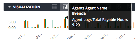
While viewing a Column chart in the Explore or in the Look, if you notice a statistic that you want more info on (in this case, a value that is higher than the rest), you can hover your mouse on it for more details: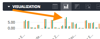
- Save the look
- Click the settings button in the top right

- Click on Save as a Look

- Add a Title and an optional Description
- Browse for a save location by choosing a folder on the left
Remember that saving into the Shared space means other users can access and make changes to this look. Saving into your Personal space means that only you can see it. - Click Save to save the look and return to the explore or click Save & View Look to save and then run as a new query.

- Click the settings button in the top right
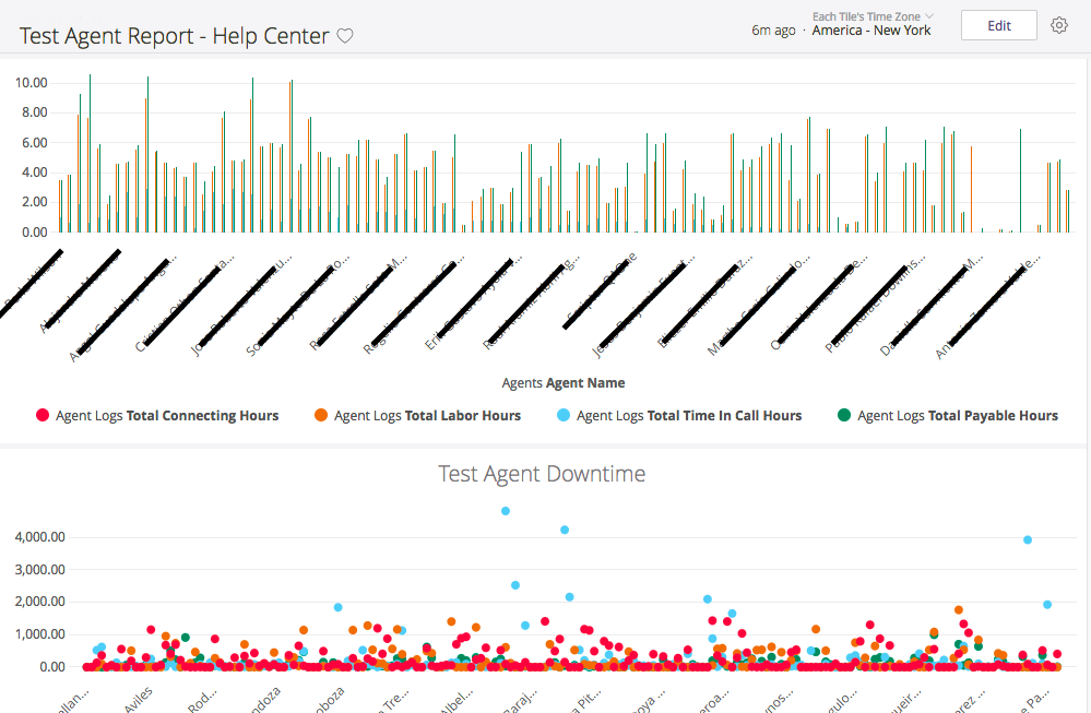
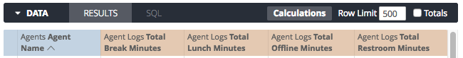
Agent Downtime
From the Agent Log explore:
- Agents:
- Click the Agents\ Agent Name dimension to add it
- Agent Logs:
- Click the Break Measures\ Total Break Minutes measure to add it
- Click the Lunch Measures\ Total Lunch Minutes measure to add it
- Click the Offline Measures\ Total Offline Minutes measure to add it
- Click the Restroom Measures\ Total Restroom Minutes measure to add it
- Modify the filter for this look
- Change Agent Logs\ Started Date\ matches (advanced)\ today to Agent Logs\ Started Date\ is in range\ 2017-07-01\ until(before)\ 2017-07-31
- Click Run to test the query
- Choose the Scatterplot visualization option
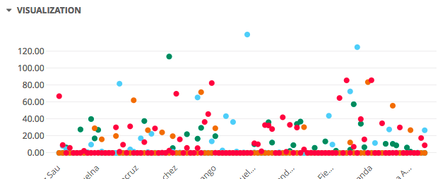
*Visualizations can be customized with various pre-made color themes or you can create your own. For more details on custom color palettes and using the color picker, click here.
- Save the Look into the same location as the previous
3. Compiling the Dashboard
Now that all three looks are complete, they need to be combined into a central location so that all 3 queries can be run and viewed simultaneously. This is what dashboards are built to do.
To create a new dashboard:
- Browse to your personal space, if not already there
- Open one of the looks that were just created
- Click the Settings icon in the top right corner of the look
- Click on Add to Dashboard

- Because we are creating a NEW dashboard, click on New Dashboard

*If this look was being added to an existing dashboard, select the desired dashboard from the space by clicking its name, and then click Add
- Type a name for the dashboard and click OK

The new dashboard will now appear highlighted in the dropdown list and the message at the top of the pop-up will reflect the visualization type of the look that was just added.
...
Another way of adding a look to a dashboard is to refer to the right-hand side of the screen when inside the look:
Add to Dashboard can also be clicked here and the steps are the same as above.- Add the other two looks by using one of the methods above.
- Browse to your personal space and click the new dashboard containing the three looks that you just added
- By default, the looks will be stacked vertically, in the order they were added
Edit the default layout of the dashboard:
- Click Edit in the top right

- Resize looks by hovering your mouse in the bottom right corner of the look, then clicking and dragging it to make the tile larger or smaller

- Change the positioning of looks by hovering your mouse in the top left corner of the look, then clicking and dragging the tile up or down
...
- While in Edit mode, you can also do the following:
...

- Looks: view a list of all your individual looks.
Any that are contained within this dashboard will have the Remove option to take them out of the dashboard:
And the rest will display an +Add option:
- Text: Any text added in this pop-up will display in its own tile at the bottom of the dashboard:

- Any text typed into the Body can be formatted using the markdown toolbar. This gives you the option to add:

 Bold text
 Italicized text
 Quoted text
 HTML code
 Clickable link to another report
 Bulleted list
 Numbered list
- Click Save to view your formatted text in the dashboard

- Any text typed into the Body can be formatted using the markdown toolbar. This gives you the option to add:
- Filters: Add or Edit any of the filters on the individual looks contained in the dashboard. Any change made here will be reflected on the individual look and vice versa.

- Settings: Modify selected options on the dashboard
- Looks: view a list of all your individual looks.
...

- Run on Load: [defaulted ON] The dashboard will perform a database query once at load time
This setting is turned OFF on all LookML dashboards. Doing so provides the user with a Run button on the top left of the dashboard so that they can choose when to perform the database query.
- Dashboard Auto Refresh: when enabled, the user can use the dropdowns to select the timing at which to refresh the data.

- Auto Refresh can also be set on the Dashboard Element Name
- Run on Load: [defaulted ON] The dashboard will perform a database query once at load time
- Once you are happy with the arrangement, click Done Editing in the top right

4. Scheduling
Setting a schedule for any report is optional; however, it is the best option if you would like to keep the saved dashboard in your personal space and still share the data with others.
Once you have a list of recipients, and an idea of the settings you would like for the report (when to send, how often, etc) the steps outlined in this article will walk you through the process.